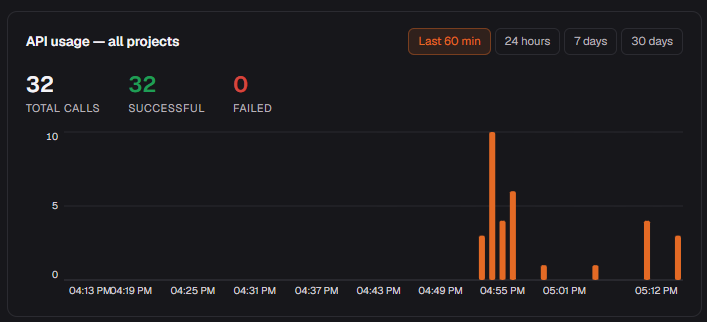
Go to Account → API Keys and click any key to see its live usage graph. Switch between Last 60 min, 24 hours, 7 days and 30 days. The project overview shows the same view aggregated across all keys.
#What to watch
- Failed calls — a spike here usually means a schema mismatch (column renamed or deleted) or an expired key.
- Call volume — useful for spotting runaway agents or unexpectedly quiet ones.
- Time window — switch to 30 days to see long-term trends; use 60 min when actively debugging a session.
Key-level vs project-level
Each key has its own graph so you can tell which agent or integration is responsible for a spike. The project-level graph on the dashboard rolls them all up.